

Embossing vs Debossing for Printed Brands: Which Finish Should You Choose?
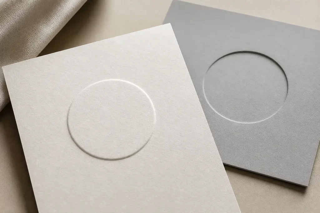
Choose embossing when you want a raised, tactile highlight that increases perceived value and stands out on packaging, covers and premium stationery; choose debossing when you want a recessed, understated texture that reads as a subtle, tactile brand mark and avoids creating highlights. The decision depends on brand intent, paper stock and artwork complexity.
What is embossing?
Embossing is a finishing technique that creates a raised impression on paper or board by pressing the substrate between a male and female die. Embossing (the raised impression) can be blind (no ink or foil) or combined with foil, ink or varnish to add colour or sheen to the raised area.
What is debossing?
Debossing is a finishing technique that creates a recessed (indented) impression below the surface of paper or board by pressing it with a die. Debossing (the recessed impression) is commonly used as a subtle mark for logos, monograms or background texture and is often specified as a blind finish without added foil.
How do embossing and debossing differ?
Embossing and debossing differ in whether the impression raises or recesses the substrate, and in their visual and tactile effects. Key differences include:
- Direction: Embossing raises the paper surface; debossing pushes it down.
- Visibility: Embossing reads more visibly at a glance; debossing reads more subtly and by touch.
- Use with other finishes: Embossing is commonly paired with foil or spot varnish for strong highlights; debossing is often used as a standalone, understated treatment.
When should you choose embossing?
Embossing suits projects that need high tactile impact, visual prominence and a premium look. Typical situations for embossing include:
- Luxury packaging and presentation boxes where a raised seal or logo emphasises quality.
- Book covers, greeting cards and premium stationery that benefit from a three-dimensional effect.
- Combinations with foil stamping or spot varnish to create bright, eye-catching highlights.
Trade-offs for embossing include a stronger need for appropriate paper thickness and potential registration challenges when combining with printed artwork.
When should you choose debossing?
Debossing suits projects that need a restrained, tactile detail without adding visual glare. Typical situations for debossing include:
- Subdued brand marks on business cards, menus or hotel collateral where subtlety supports an understated identity.
- Large-area textures and patterns that read by touch rather than visual contrast.
- Applications where you want to avoid reflective surfaces or additional colour on the impression.
Trade-offs for debossing include lower immediate visibility at a distance and the need to consider how deep the impression sits on thinner stocks.
What practical considerations apply to both finishes?
Practical considerations for embossing and debossing include paper selection, artwork preparation, die construction and finishing combinations. Specific points to plan are:
- Paper and board: Choose a stock with sufficient body or fibre to hold an impression; uncoated and thicker boards typically show crisper impressions.
- Artwork: Supply vector artwork for dies and leave clear surround for the impression to avoid unintended crushing or distortion.
- Die type: Plan for male and female dies (or a counter) to control depth and definition; deep impressions need appropriate countersupport.
- Combining finishes: Decide in advance if embossing/debossing will pair with foil, ink or varnish so registration and order of operations can be set.
- Proofing: Request a sample or press proof where possible to confirm tactile effect and registration before full production.
How do you specify embossing or debossing for a commercial print job?
To specify embossing or debossing, provide a clear finish instruction, the vector die outline and the chosen substrate, and indicate any combination with foil, varnish or printed elements. When preparing files:
- Create a dedicated spot-colour layer that shows the exact shape and position of the impression.
- Provide vector outlines for the die; avoid rasterised or low-resolution graphics for the impression area.
- Note whether the finish should be blind (no foil/ink) or paired with foil, and indicate any registration tolerances.
Print vendors typically offer design support and prepress checks to verify suitability; plan for a proof to confirm the final tactile and visual result.
Summary
Choose embossing for raised, attention-getting highlights and choose debossing for recessed, understated brand marks; both finishes require careful choice of paper, vector artwork for dies and coordination when combining with foil or varnish. Early planning and a physical proof are the simplest ways to ensure the finish matches brand intent.
Discuss your print project or request a tailored quote from PrintPlus.